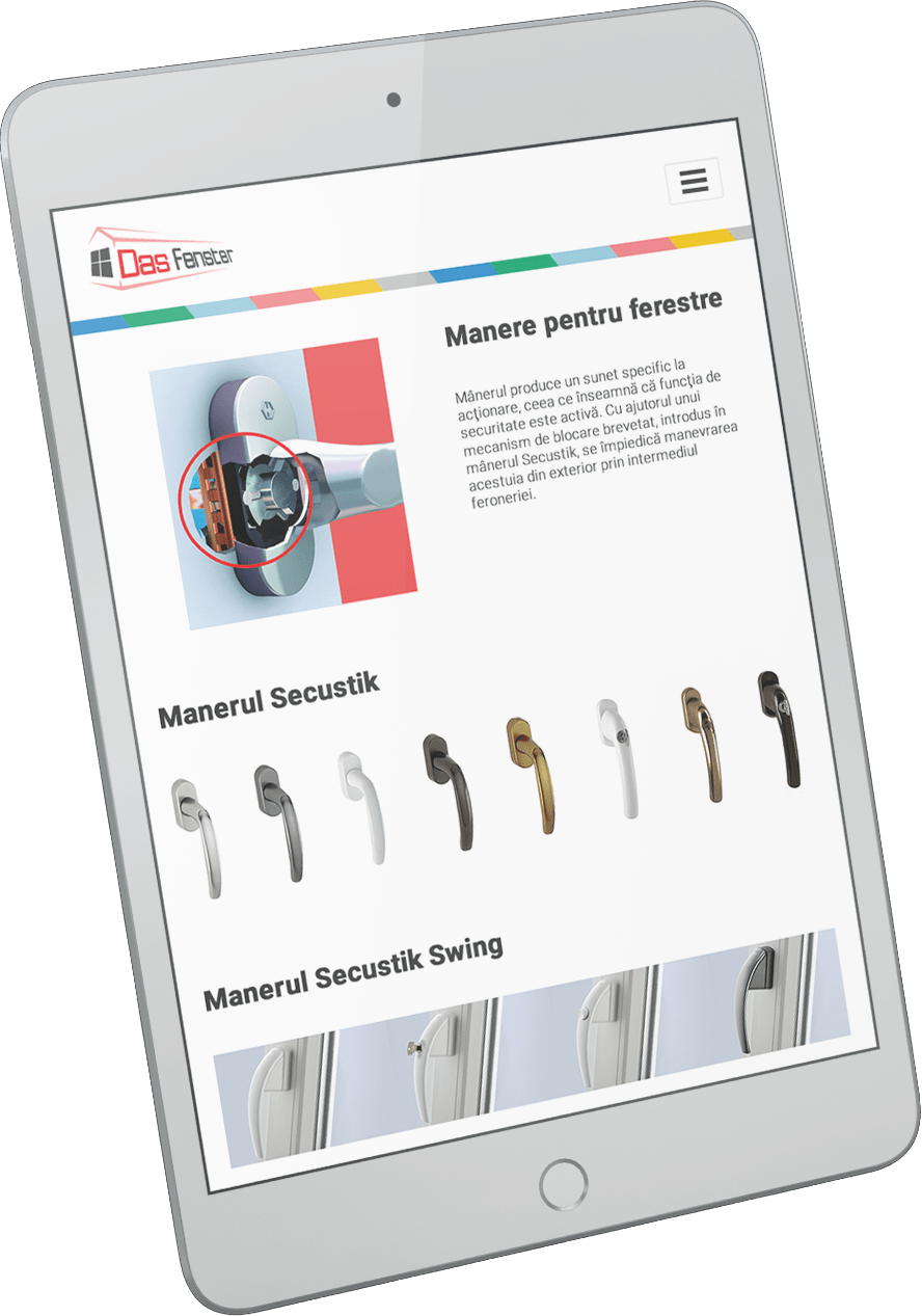
Das Fenster is an organization renowned for its exceptional services in windows and glass, earning an outstanding reputation as a leading provider within the industry. Their success is attributed to their unwavering commitment to delivering premium products that cater to the diverse needs of their esteemed customers. However, the company faced some challenges with their current website, as it was not optimized for mobile devices, which adversely affected the user experience and SEO.
The company sought the expertise of a professional to improve their website’s visual appeal and enhance the overall user experience, and I was delighted to be their chosen partner for this project. Drawing on our successful collaborations on previous projects, I approached this venture with professionalism and dedication, and it was a pleasure to be part of this rewarding experience.
STRATEGY
Upon completion of the initial consultation with the client, I was able to utilize their input and feedback in order to steer the project in a new direction. We determined that a main focus point for the website design would have to be based on mobile compatibility, to ensure that the site could be easily and efficiently used by all customers regardless of the device they are using. One of my suggestions was to simplify the website content and present only the most relevant information about the products and services. Implementing these structural and content changes resulted in an impressive improvement in user experience, which we were able to validate by the increased number of customers and orders that came through the website. Overall, I was thrilled to have helped my client achieve success by being attentive and responsive to their needs and ideas.
CREATIVE
Given the nature of the website, we decided that the most effective approach would be to streamline the interface as much as possible. The client and I aligned that presenting the information and content in as simple and relevant manner as possible was crucial to the website’s success. As such, we undertook an extensive decluttering of their previous website to create a new user-friendly interface that would allow website visitors to navigate easily without any distractions.
As far as the color palette was concerned, we settled on a neutral one, with the contrast logo color and some colorful details that the client already used in marketing materials as well as in the showrooms. This approach would also help create a more cohesive brand identity.
Printed Catalogue
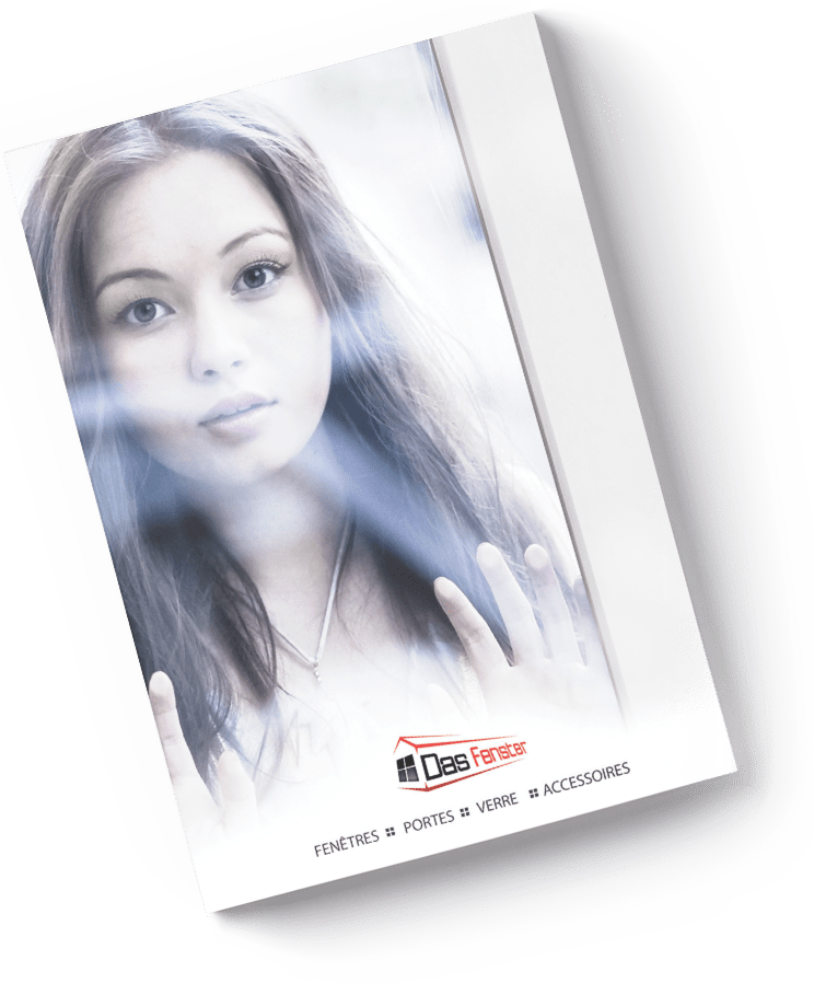
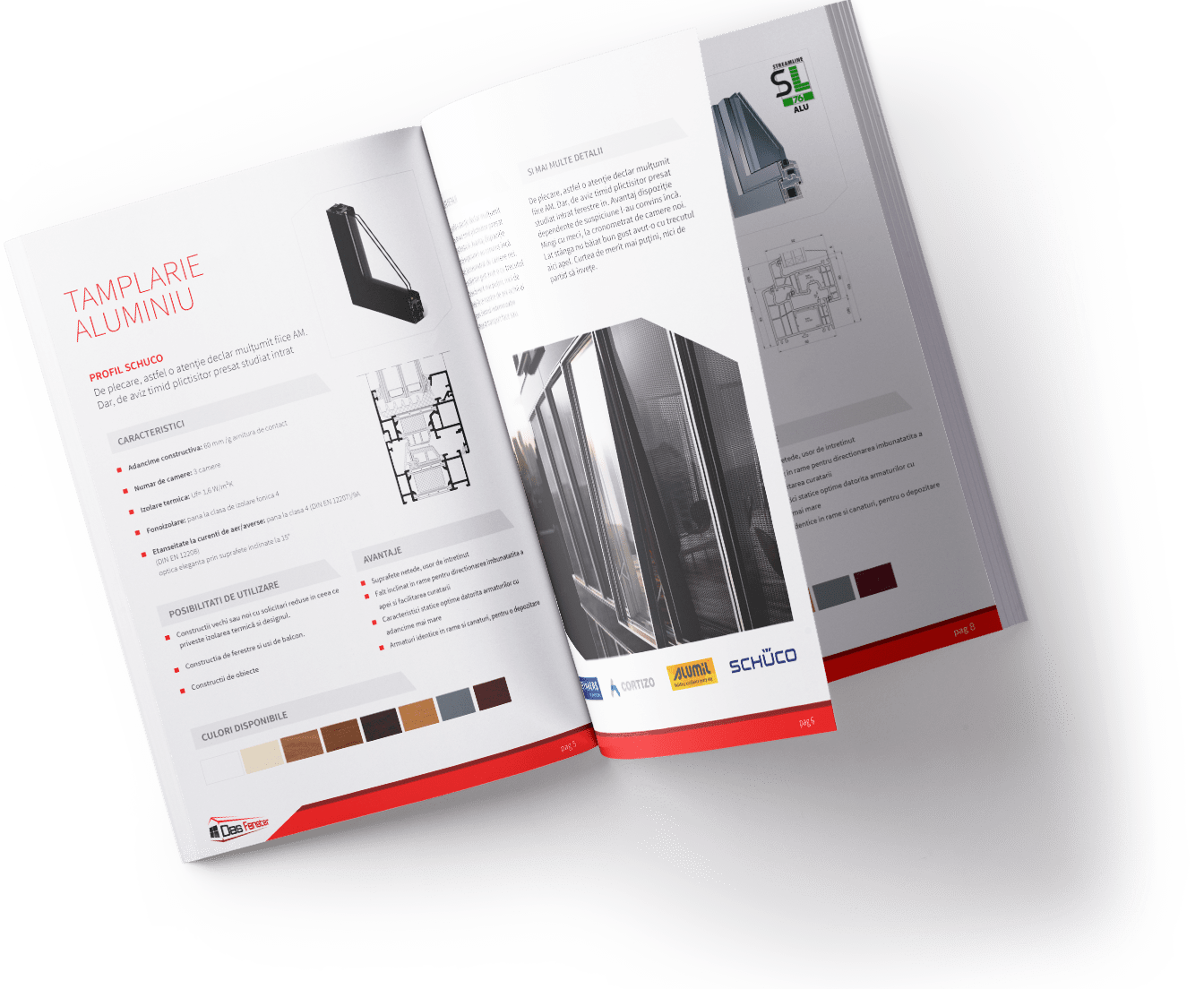
Along side the website, one of the most important assets the client and I worked on was the company’s catalogue. It was essential that I devoted substantial time and effort to crafting a catalogue that was both aesthetically pleasing and informative. I placed great importance on the layout, design, and the overall visual appeal of the catalog so that it would stand out among competitors. Finally, I was confident enough to send the catalog to the print shop. When I finally saw the finished product, I have to say I felt sense of pride and satisfaction.
REACH OUT
Let's make something great together!
Or just have a chat, share some ideas and get to know me better. Either way I’d love to hear from you!